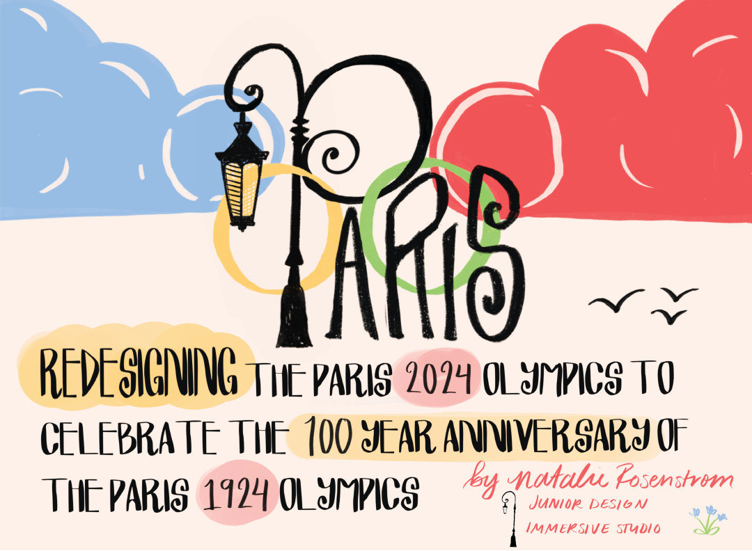
Over the course of 8 weeks the Olympics Project required that we chose an olympic Games to rebrand with a logo, three posters, and a third element of our choosing. This is my redesign of the Paris 2024 Olympics to celebrate the centenial of 100 years ago: Paris 1924 Olympic Games.
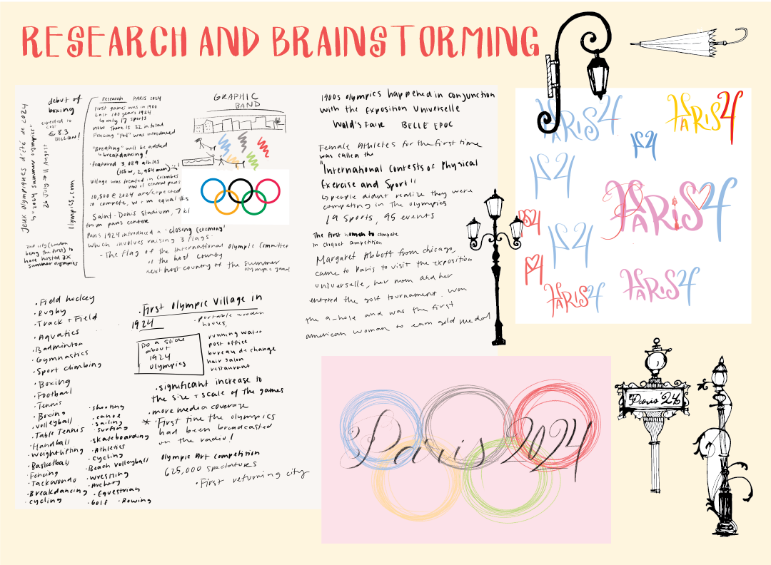
Through research I discovered that Paris was also the home to the 1924 Olympic Games, making the 2024 Olympics the 100 year anniversary!
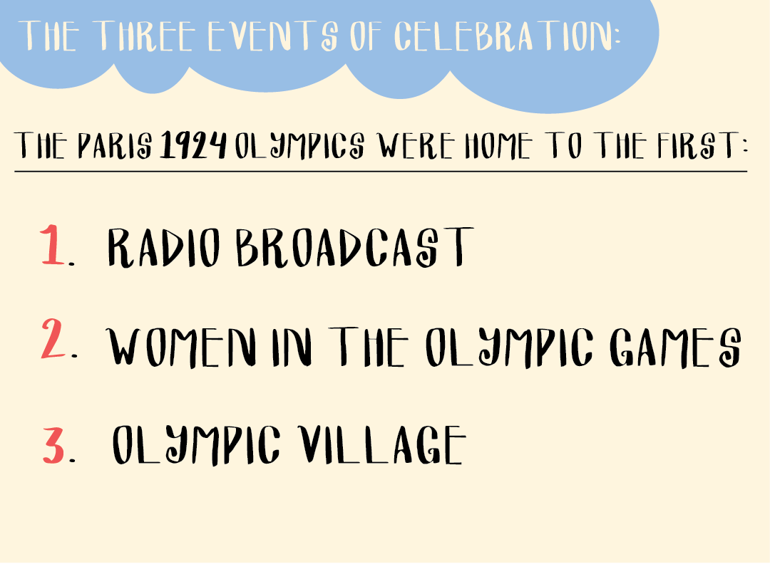
100 years ago at the 1920s Oympics, Paris was the first olympics to have a radio broadcast, the first time that women players were admitted and the home to the first Olympic Village. These will be the topic for my three posters later on.
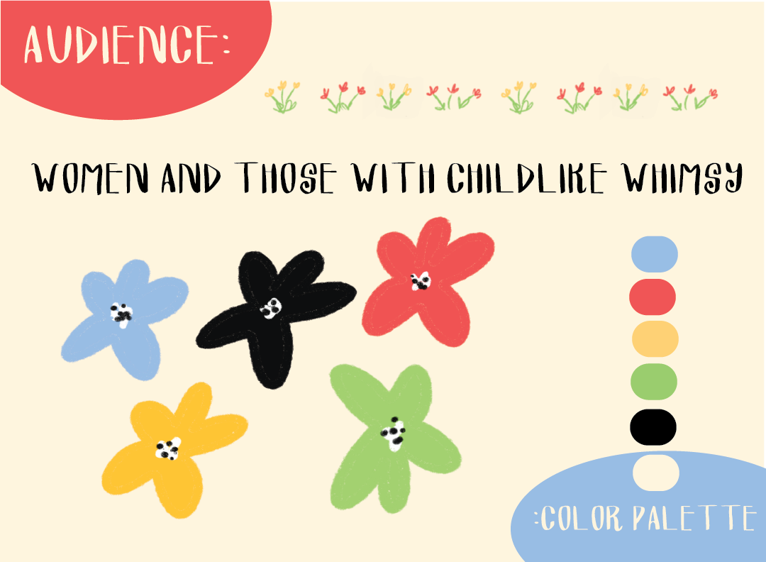
My audience for this project is women (celebrating 100 year anniversary of women in the olympic games) and those with childike whimsy, simiar to myself.
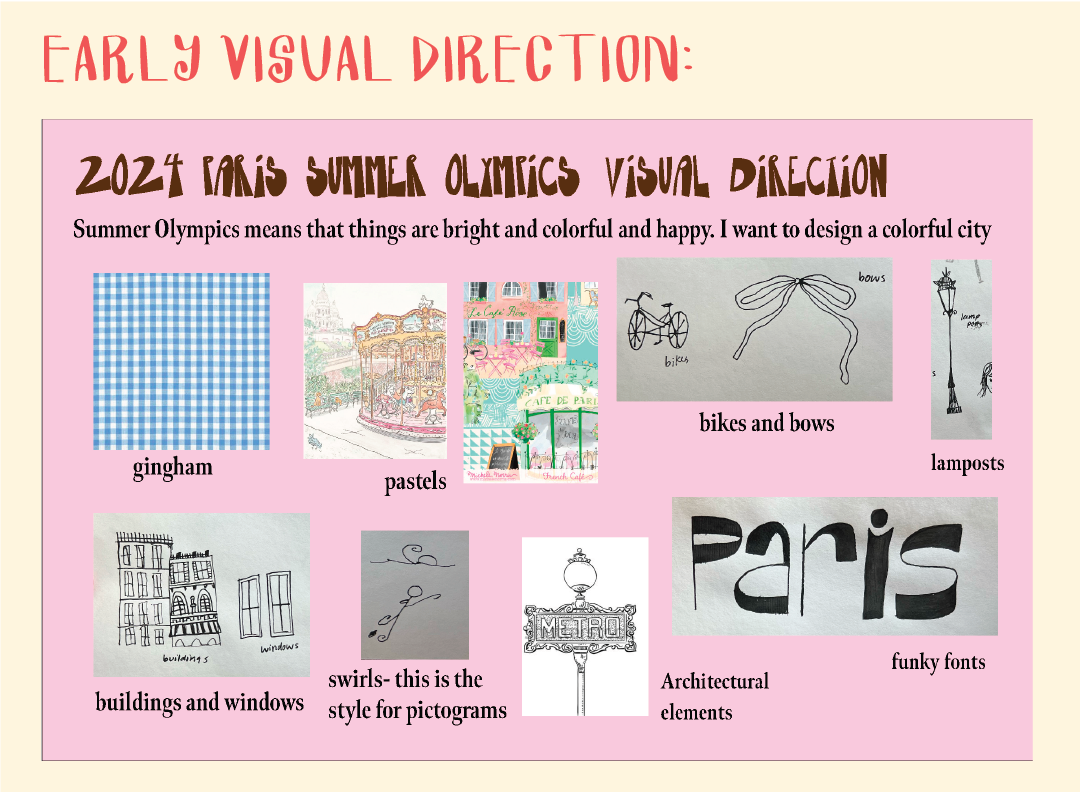
Some of my early visual direction included gingham, pastels, and inky pen drawing to emulate the aesthetic of paris that I was trying to currate.
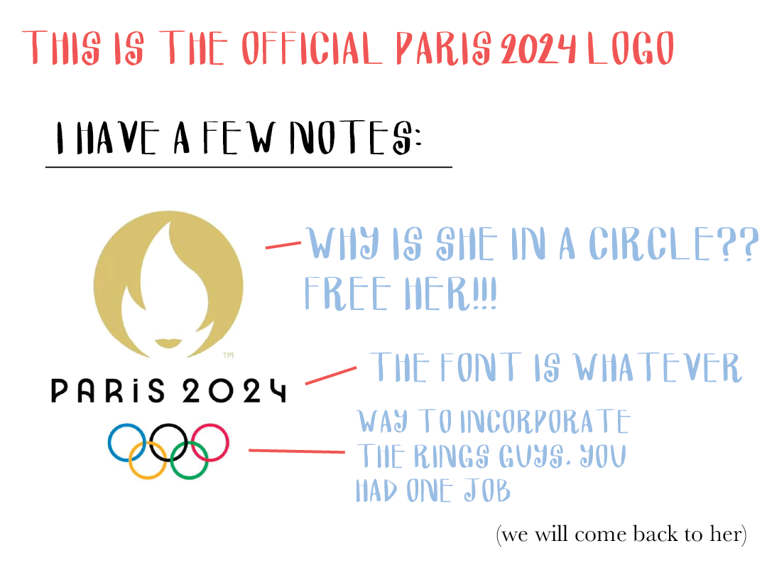
Pictured above is the official Paris 2024 Logo. I am not a fan personally but we will come back to this logo in one of my posters.
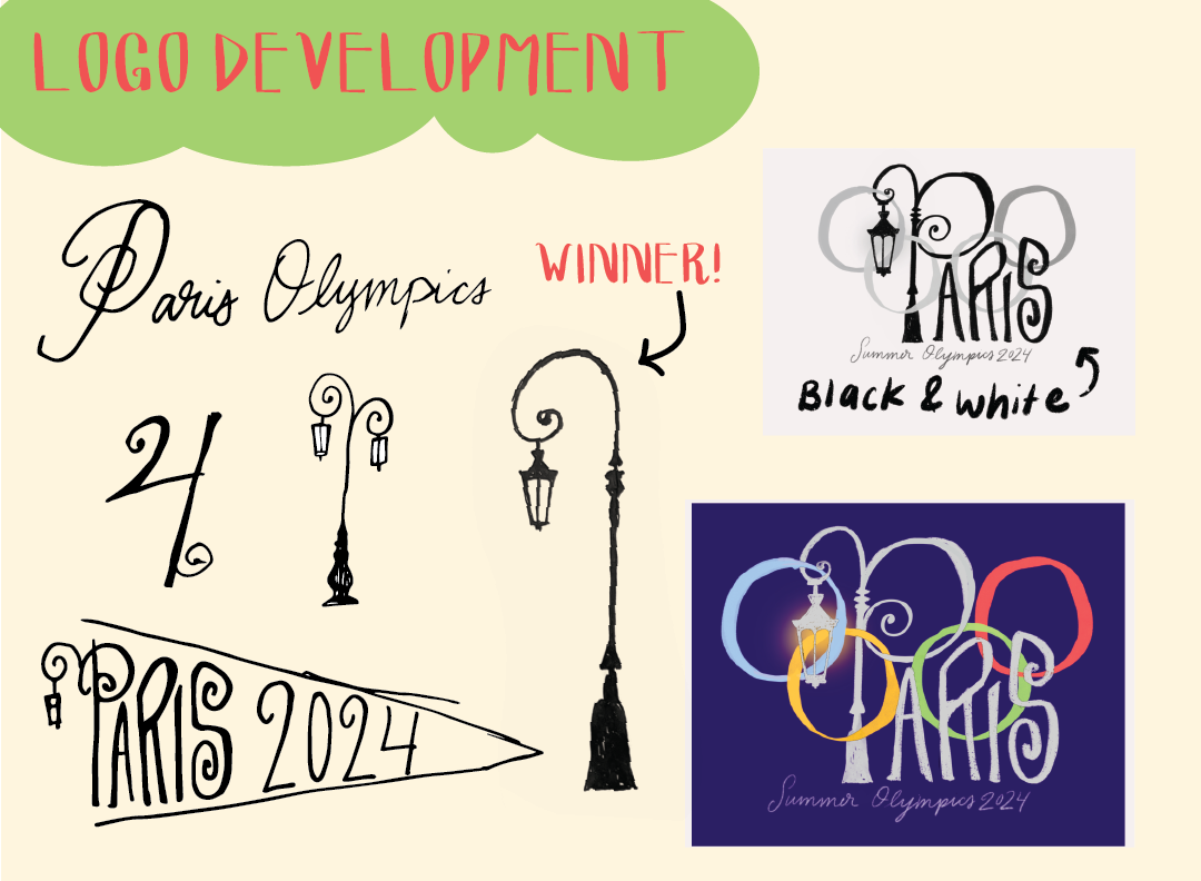
I started brainstorming some designs and fonts that I liked for the logo. I knew that I wanted the logo to be handwritten and have a parisian feel. These are some of the sketches I drew up using pen and ink. This lampost worked perfect for the stem of the P.
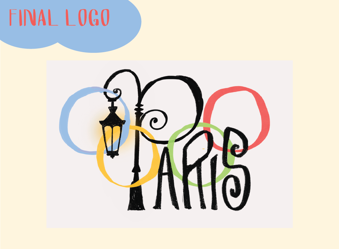
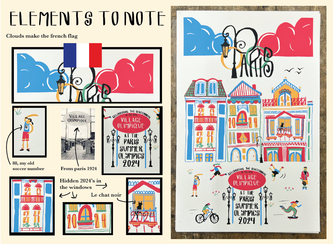
This is my final logo, incorporating the P into the Olympic rings.
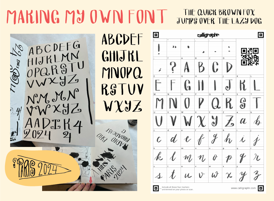
Continuing with this style of pen and ink I wanted to create my own font for this project. I used a website called "Calligraphr" to digitize the font so that I could type it right into my designs in Illustrator.
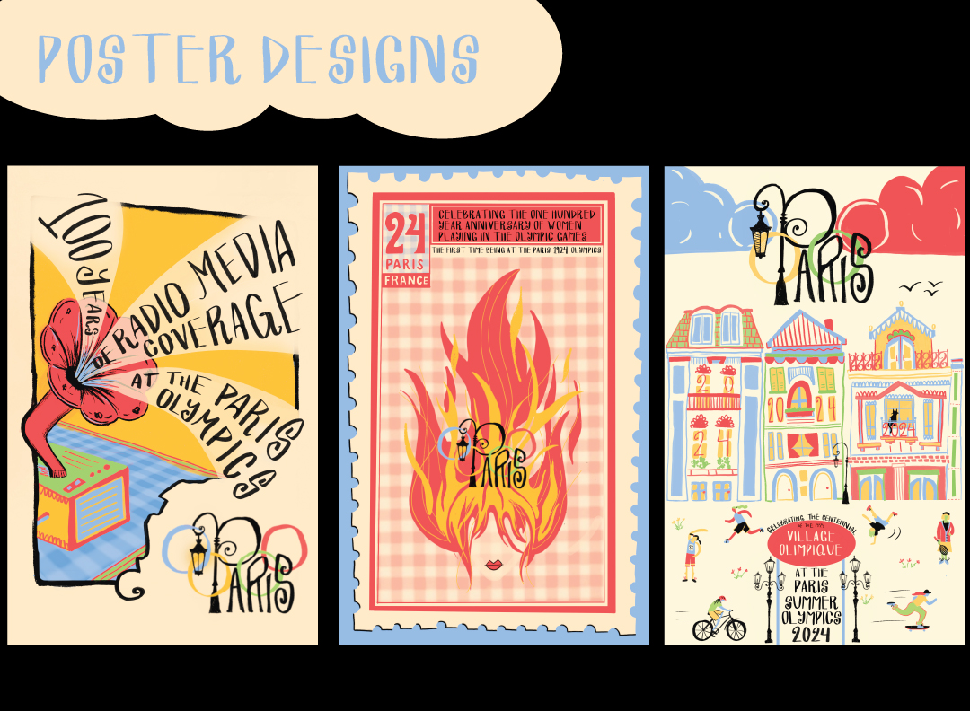
After the logo came designing the posters, here they are all together but I will go in depth of each of them.
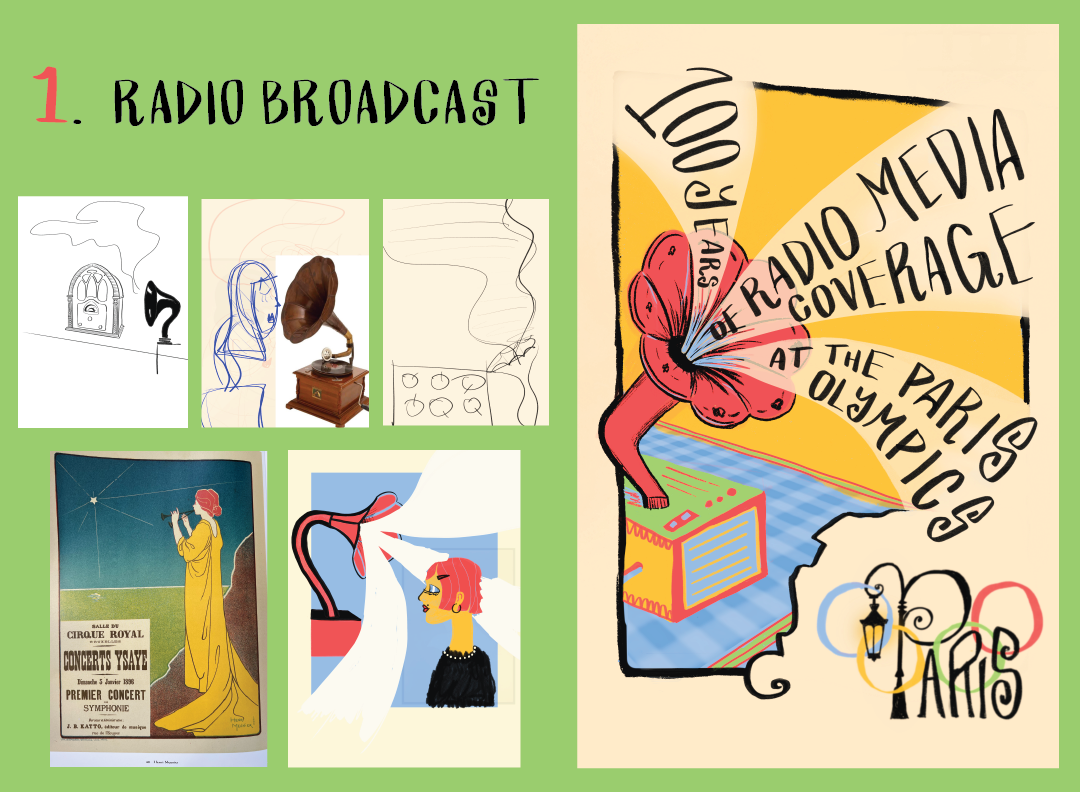
First off was the poster to celebrate "100 years of Radio Media Coverage at the Paris Olympics". I wanted this poster to have an Art Nouveau feel with the boarder and format of the poster. I chose to include a victrola to add to the 20's feel of the poster.
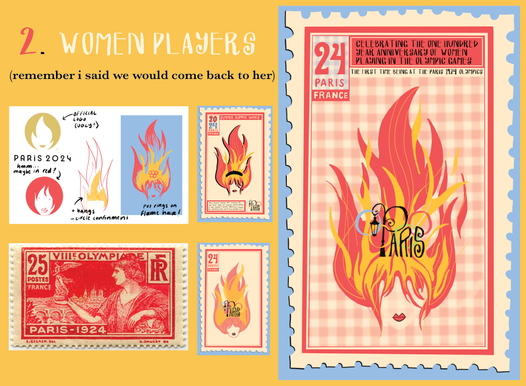
The second poster was to celebrate the anniversary of women players in the olympic games. Taking inspiration from the official logo, I liked the notion of a lady with fire hair but not in a circle. I experimented with taking her out of the circle and extending her hair and messing around with her hair in a way that could accomidate the location of the rings in the logo. Through my research early on I found this stamp from the 1924 olympic games and thought it could be cool to pull in some elements from it. I swapped out the "25 postes france" for a "24 Paris France" to include the 24 of 2024, additionally borrowing the boader format of the stamp.
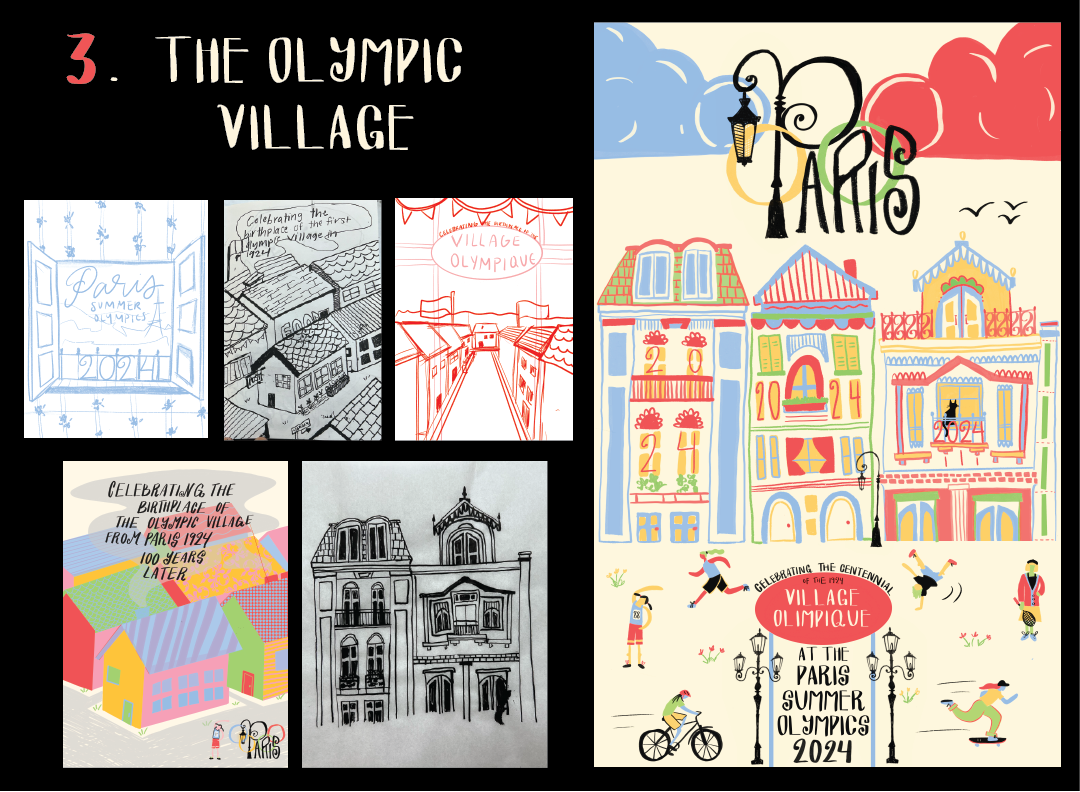
The final poster was for the Olympic Village. This design was a bit of a fight. I knew I wanted to include houses and architecture of paris but I couldn't figure out the composition until I leaned on my early sketch of inky houses that I knew I wanted to build off of a city landscape.
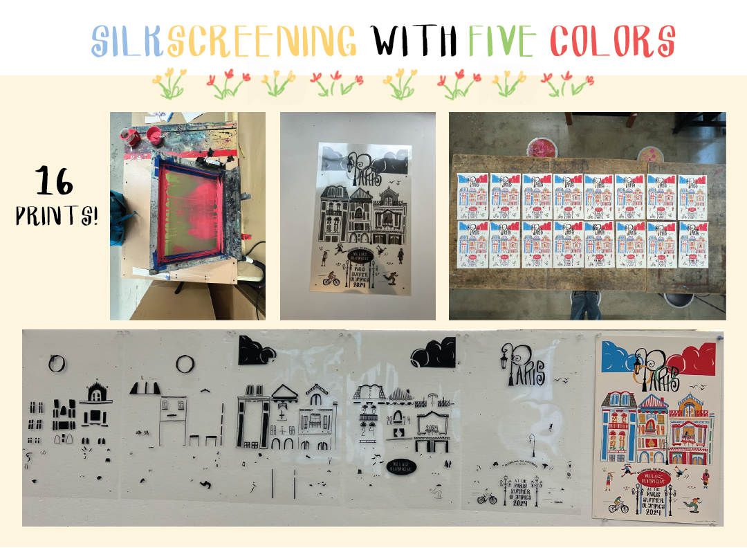
For the third part of the assignment I made the bold choice to screenprint my olympic village poster with five different colors. With help from the print lab I made printed out